Problems & Goals
Plan day is focused on company and employee workflow .It requires to be intuitive and efficient to assure a cohesive communication by both parts implied. As user of this application I have noticed many areas to improve this, making subsequently benefit the app main objective.

Decisions
Given that the primary aim of Plan Day is to facilitate dialogue between users and their employer, all adjustments have been driven by the notion of developing an app that's instinctive for everyone, regardless of background, age or profession.

At first glance the original design is not very inspired, slightly cluttered and it is a missing opportunity to not use the brand colours instead of a combination of sheer white, grey or black.
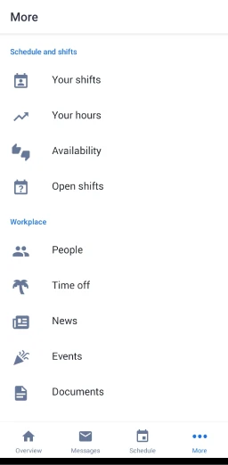
The first thing you currently see is a “requests” option. I was surprised to find out nobody I asked has ever used it. In fact, if you have a request confirmed or pendant it appears in “messages”, so I do not see any benefit on having this instead of prioritizing “punch the clock” option.
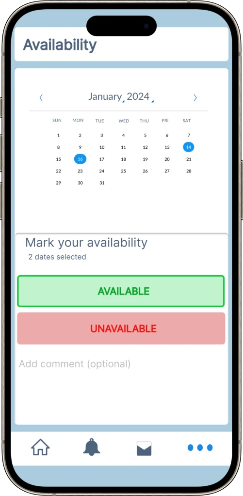
Some users with sight problems have complained about how hard is to read their Schedule without clicking to enlarge it, and when they do the menu is complicated for some of them.
Menu buttons might be more visible and make use of a better selection of them. “Schedule” button has the same effect that if you press the main section “your schedule” or “see all”, too redundant.


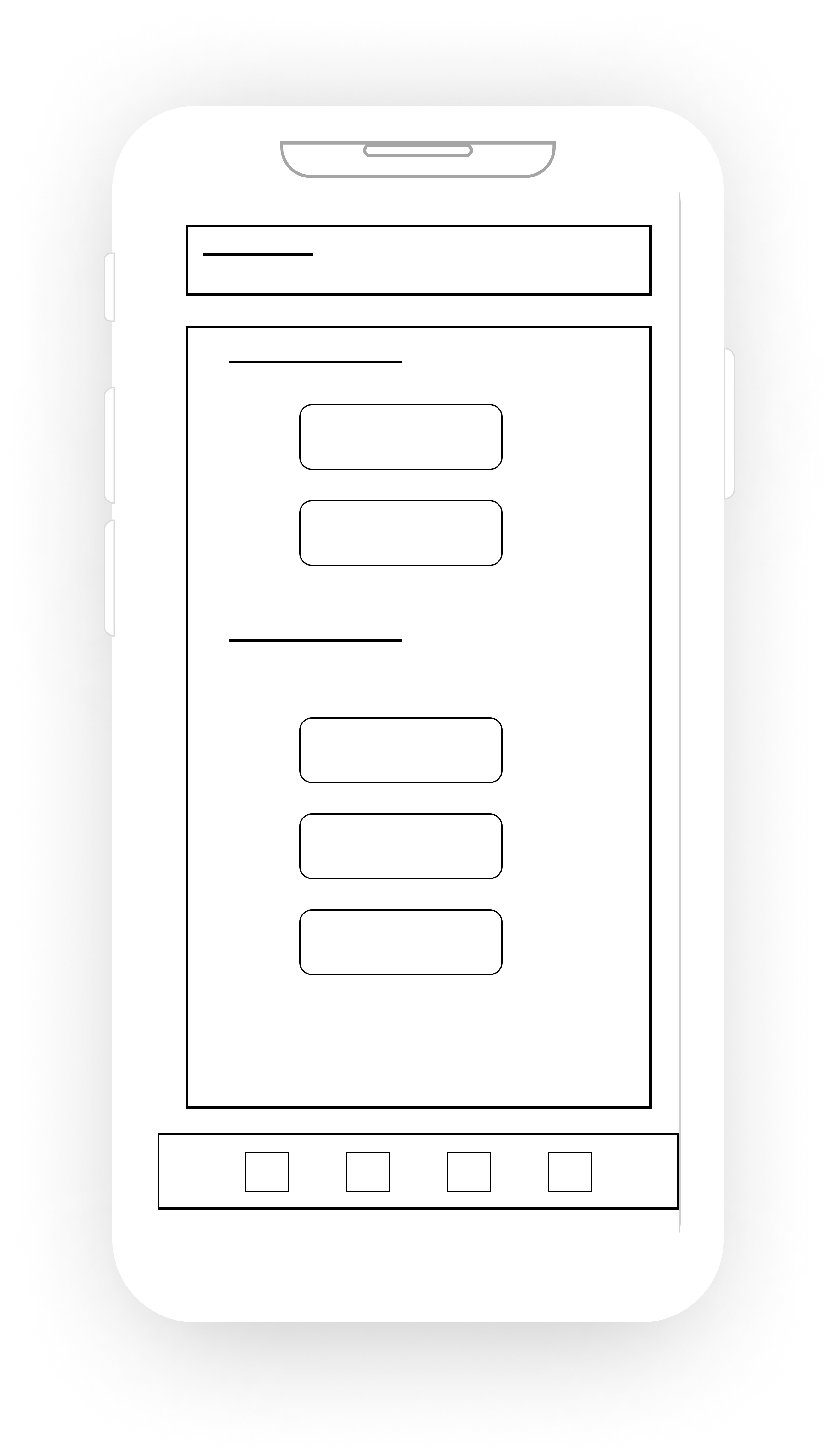
First wireframe drafts the changes exposed previously. The punch clock and shift menus are bigger and the schedule includes a calendar button.
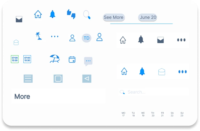
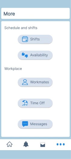
The next clay model shows a menu that gives quick access to the app’s key features, cutting out unnecessary options and complicated navigation. It keeps everything simple and easy to understand
# FFFFFF
Main White
# 4D617A
Grey Light
# D8E1EF
Primary Gray
# AACBDD
Light Blue
# 0593FF
Secondary blue
#1E86E7
Primary Blue
# 0E6AE0
Dark Blue
I made sure to choose a selection of colours that can be identifiable and related with the brand but giving a more joyful perspective of it.
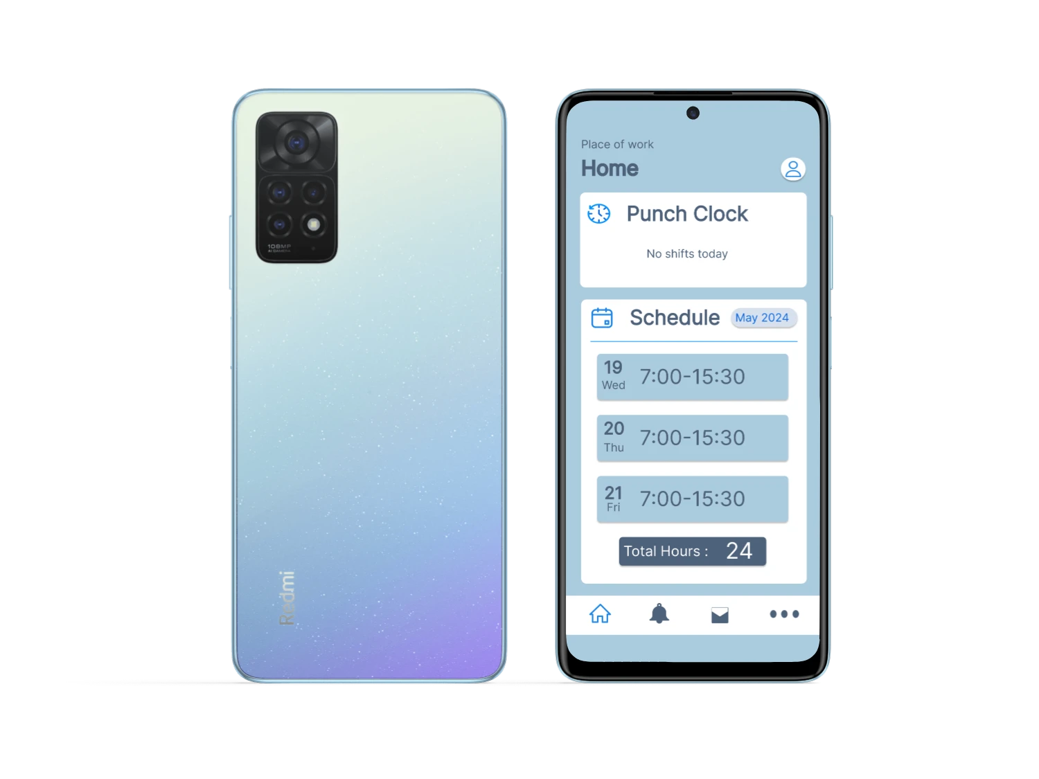
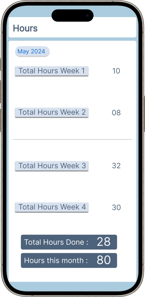
The timetable showcases a significantly larger font, enhancing readability of your duty hours, and includes a menu at the top right corner for review of past or future dates.
A button indicating total weekly hours is now present. I've incorporated new large, uncomplicated buttons that radiate a blue hue, instantly indicating your current section.
The new layout brings a completely fresh look, building on earlier ideas. I’ve replaced the “requests” section with “punch the clock” and added some new features and colors. The area is now called ‘Home,’ with a calm grey background to tie it all together.
Gallery
See below a comparison of how the app was looking before and after the redesign and the new features added.


This is the refreshed version of Plan Day, exhibited in the following slide show. Utilize the left and right arrow keys for browsing.